App Design and Prototyping Process

For the past two weeks we have been working on App Design in XD. The project was design an app we’d like to use and create a prototype to showcase features and productivity.

Our first step was to come up with an idea and pitch it to our instructor. I chose my app based on the gaming community I am apart of which has come across a need for better communication when it comes to upcoming games and events. Inspired by an app we use for our child’s school and classroom communications, I decided there was a need for something like that is for groups outside of schools.

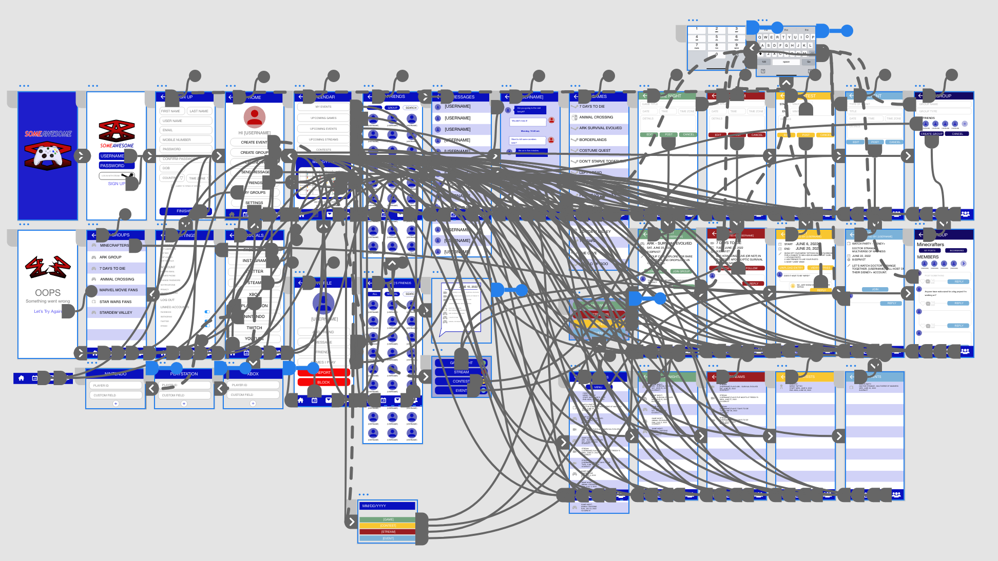
The second step required sketching it out. We needed at least 4 screens showing main elements like buttons, input fields, and text. We had to draw lines linking pages together for a rough idea of how the app would function. We were to also include a Splash page and an Error page.


While this wasn’t technically part of the assignment it was obviously necessary for the next step. We had to build a wireframe with the elements included (I guess they figure we’ve got this step down by now) in order to begin the prototyping process

This project got a bit out of hand for me. Every idea I had required a new screen. Essentially what I’ve come up with is a social application where community members can share info in an environment catered to them. While the potential for this app is not limited to gamers, that was what I started with because this is something I feel the community I am apart of could and would use,

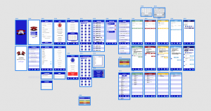
Step four was the fun part. Actually connecting the pages and creating the functionality of the app brought it to life. And while it doesn’t actually work, it felt like it did.

The prototype phase looks like a mess. A complex web of lines connecting pages to pages, to overlays, to links. My respect for app designers has skyrocketed during this assignment!

And here it is, the demo of my app prototype. Like I said, I really enjoyed this assignment, and while I’m not sure how to code it (yet) it was really cool seeing it in action.

Furniture Catalog Project

This week in InDesign our assignment was to design a furniture catalog layout. This was the perfect chance for me to collaborate with my dad who makes beautiful, quality, solid wood furniture. 

He sent me several photos he had taken over the years, and I got to work on the catalog layout. 

Even though I was using these farmhouse themed pieces of furniture, I still wanted the catalog to have a modern contemporary look. I quickly realized that even though I wanted to showcase all of his pieces, fitting them all into the design was quickly starting to look very amateur so some needed to be cut from the design. 

My other problem was that when most of the photos were taken, “product photography” was clearly not the main priority. Thankfully he had taken most of them outside and in good lighting so I had pieces to work with. I chose my two feature photos that would have an entire page dedicated to them and worked on the placement of the others. 

My dad’s latest builds were Adirondack chairs so I had several images of those to work with, including the gray stained set with matching table and footrest that he’d made for my sister. They’re gorgeous so obviously that would be one of the featured pages.

The next two pages features different shelving units he’s built, and while I love the cube storage he built especially for me, it was the art deco corner hanging shelf that caught my attention as the next featured image. 

I did a lot of photoshopping for this project. Even though the images had decent light, the backgrounds weren’t always ideal. A little perspective warping, and some color adjusting to give life to the dormant winter grass really gave the images a more “catalog” look. 

The end result was a 5 page layout that both he and I were proud of.

Web Ads Assignment

This week we worked on product ads for social media and websites. Our job was to use or create a product and design a cohesive ad campaign for the different dimensions that would be used on the different sites.

Size requirements:
Instagram Story: 1080 x 1920
Instagram grid: 1080 x 1350
General website: 300 x 250
Website (leaderboard): 728 x 90
GIF (not animated): 250 x 250

Brainstorming:
My idea was to create a fictional brand so that there would be no conflict with copyrights with these in my portfolio. I named my company “Your Cosmetics” which is self explanatory. I decided that we would be advertising our annual Spring Sale offering 40% off all skincare products. 

Concept Development:
I had an idea of what I wanted my ads to look like so I chose a color palette and the typefaces that would work with my vision. I needed a typeface that complimented my logo, but I wanted a bold eye-catching font for the “Spring Sale” especially considering how small some of these ads were to be.

Concept Refinement:
I created the multiple artboards I needed and began by adding all the elements I knew I would need on each board. That included the  background color, company logo, and copy. I chose purple with a spotlight gradient coming in from the (stage) right. A rectangle banner would house the Spring Sale headline and the product would be featured underneath that. I also designed a call to action button that would be on the ad.

Next, I found a high resolution stock image of blank cosmetic bottles that would fit my theme perfectly. I masked those out in Photoshop, then I duplicated the image, reflected it, and lowered the opacity to create a reflection. It was a simple process and gave the ads a very professional finished look.

Also, because I’m always a little extra, I added the Instagram “swipe up” overlay that you frequently see amongst the stories, and the “shop now” box featured at the bottom of their grid ads. 


Overall I was very pleased with the outcome, and enjoyed creating them.